 ARCHIVE
Almost Home - Jan Brouckaert
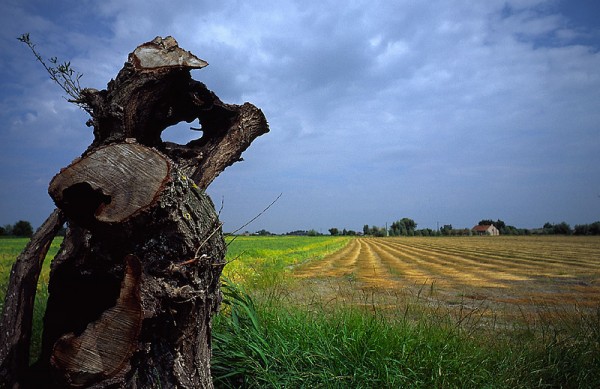
Guys, I cant choose between this image and its B W version, what is your idea ? --- Do Click to enlarge --
| Camera: | Contax G1 |
| Lens: | Carl Zeiss Hologon 16mm f/8 |
| Film: | Velvia |
| Exposure: | nr |
| Flash: | |
| Support: | |
| Filter: | |
| Adjustment: | |
| Posted: | 31-Jul-2002 |
Rating: 8.00 (4 ratings)
Comments
Arresting . . .
Jan visually the color version has ignorantly greater appeal. Each element is better rendered detail wise. The colors are complimentary. The black and white version proposes a different mood. That mood is hardly as arresting in comparison to the color version. The growth lines for instance in the stump are poorer, the grasses do not appear to have well defined and graduated tones. Jan, that said--had you presented me with simply the BW choice--I would not have been aware of the differences. ;-) Color for this theme is more better.
Jerome Belthrop 31-Jul-2002 at 14:36details
Jerome, I sharpened the B&W version now, so the difference should't be that bog between the two versions, thansk jan
Jan Brouckaert 31-Jul-2002 at 15:57.
I like the B&W better. I think the color version is a little too. Well, that is Velvia! The B&W version does have a different kind of drama to it, and to my eyes a more compelling one.
Steve Novosel 31-Jul-2002 at 16:22Colour
I prefer the colour version - I think it increases the seperation between the tree and the field. Either way a very well observed image.
Steve McBride 01-Aug-2002 at 01:09Jan
no doubt in my mind. I prefer the colour version. I particularly like the complimentarity of the colours and the soft palette. Well seen, Jan.
Knut Skjærven 01-Aug-2002 at 01:39