 ARCHIVE
Poles Apart I - Jan Brouckaert
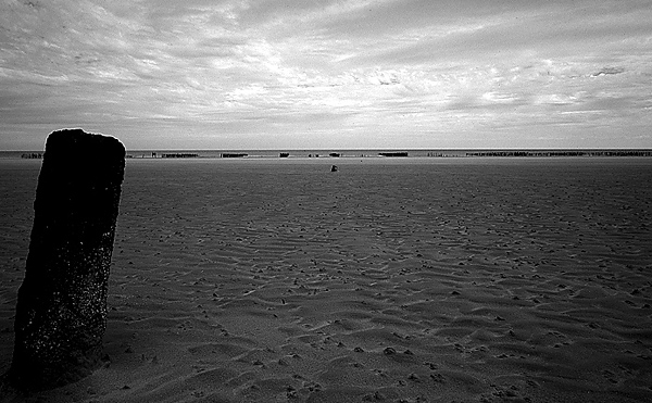
The second image of the serie Poles Apart. Slightly sharpened the way explained by Wilfred in his 'sharpening and downsampling' article on this site.
| Camera: | Contax G2 |
| Lens: | Carl Zeiss Biogon 21mm f/2.8 |
| Film: | velvia Converted |
| Exposure: | |
| Flash: | |
| Support: | |
| Filter: | |
| Adjustment: | |
| Posted: | 17-Jul-2002 |
Rating: 8.33 (6 ratings)
Comments
-
Jan, this is beautiful. Wonderful texture and tones. Excellent placement of elements as well. I decided I'm going to start experimenting more with using Velvia for the express purpose of converting to B&W. One, for the fine grain. And two, I think the stronger contrast inherent in Veliva might be interesting to work with when doing a conversion to B&W.
BTW, I'm getting into Piezo inkjet printing of B&W using MIS pigment quadtone inks in my Epson 1160. This one would be a wonderful candidate for printing this way. Have you considered exploring the world of digital B&W printing using these inks and the PiezoCone driver software? If not you should as the software can now be bought much cheaper since it is now unbundled from the inks. AND they just introduced Selinium toned ink sets! This image would be great as a selinium-toned print.
For those who may be curious of what I'm talking about go here: http://www.piezography.com/
Richard Sintchak 17-Jul-2002 at 15:23-
BTW, did you use the Russell Preston Brown technique for your conversion here?
Richard Sintchak 17-Jul-2002 at 15:24Fantastic
This might be one of my favorites of the many stellar B-W landscapes that you specialize in Jan...the textures and the clouds are really sumptuous here. Great work, and as Richard said, I can only imagine what a print looks like.
Robert Mirani 17-Jul-2002 at 18:59Good,
..., yet, I like #1 better. It adds some 'extras' this image doesn't offer IMO. Not that I'm against minimalism, but it seems there's not much going on here. Or perhaps this is because this kind of beach scenes is too familiar to me.
Wilfred van der Vegte 17-Jul-2002 at 23:45Foreground
Jan, the feel a bit dark and oppressive for a sea scape. That is not a negative comment--as you have elecited emotion from me.
Jerome Belthrop 18-Jul-2002 at 05:23b&w conversion
Rich, thanks for the comments. I tried the method you mentionnned and it works very well. However, I find this tool very usefull when it come to images with a lot of different colors, when it comes to images like this, with only two main colors I found the PS conversion + adjusting contrast strong enough. I just acquired a new scanner and the next step in the process will of course be a high end printer. I know that Epson has made new models but do they include 'DYE END SUBLIMATION' ? I heard that this technique reduce the effect of seeing all these little points of which the image consists and make it really a picture. (I know that Canon uses this technique) ?; Thanks Jan
Jan Brouckaert 19-Jul-2002 at 00:44