 ARCHIVE
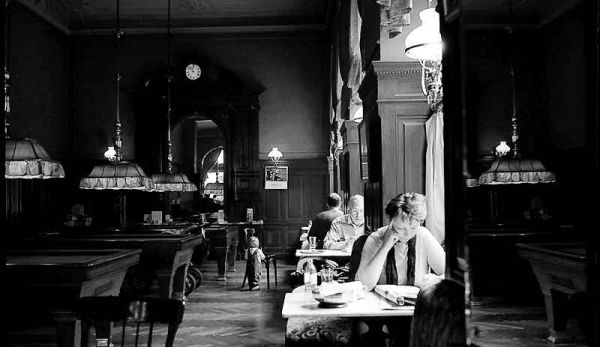
Cafe Sperl - Readers - Jerome Belthrop
Click for larger view, please.
| Camera: | Contax G2 |
| Lens: | Carl Zeiss Biogon 21mm f/2.8 |
| Film: | Ilford XP2 |
| Exposure: | unrecorded |
| Flash: | |
| Support: | |
| Filter: | |
| Adjustment: | Curves, Levels (manually) Selective sharpening, spotting |
| Posted: | 19-Jan-2004 |
Rating: 8.37 (19 ratings)
Comments
Jerome,
There is such a nice vibe in these cafe photos that makes me want to be there.
Vahid Naziri 19-Jan-2004 at 08:34sparkles
rich, rich, rich!
Robin Kleb 19-Jan-2004 at 09:19Lots
of good details here Jerome. Mood is good as well. Glad to see se that you are still kicking :-).
Knut Skjærven 19-Jan-2004 at 09:26A warm hearted place . . .
Vahid, each time I go to Vienna, I stop here. The food is traditional (fattening); the espresso delicious, and as you can see-- sitting about in a window booth the light is good enough to read or people watch for hours. Drop in: Gumpendorfer Strasse (st.) nr. 11. . .
Jerome Belthrop 19-Jan-2004 at 09:48Lots of Sparkles ..
Robin, Knut, thanks for the comments... yes-- its time for me to get off the fence gand give folks something to comment upon. ;-)
Jerome Belthrop 19-Jan-2004 at 09:52exposure
I have a question Jerome. Is xp2 capable of handling the latidude that is in this picture? I would like to see the exposure on the people reduced. One thing that only film can do is handle detail even with bright lites. Great shot, Dave.
David Risch 19-Jan-2004 at 10:03Very nice mood,
Jerome, it is often difficult to catch such a quiet mood , as you have done so effectively here. I would be inclined to darken the area of the readers(as has been mentioned) but not at the expense of the darker details to the left. Nicely captured! Linc
Linc 19-Jan-2004 at 11:01Dave.Lincoln. . . into the light ...
Dave, XP2 is designed to accommodate very broad exposure latitudes; to achieve the finest grain expose it at EI 50/18 up to EI 800/30 for greater grain. Greater grain --that could be a pun, except we have seen many presentations here that have artfully used greater grain to add demonstrative character to their subject matter. This pdf file includes the more technical information that I can digest--but you might find useful in deciding if the film is useful for your applications. In my case I exposed the film at the standard ISO 400 rating. The room had extreme areas of brightness and darkness. As I seldom create paper prints of any of my images--I optimized this image for screen presentation. When I darken the faces of the readers--they become unnatural to my eye--however, as I garner more expertise using Photoshop--your and Linc's suggestion's merits might be better realized. Thank you both...
Jerome Belthrop 19-Jan-2004 at 11:28-
Very nice but I find it a little top heavy with a slight feeling of being cut-off at the bottom---that's just me though. Highlights a bit blown out too but still decent detail there. Good choice of XP2 for this. BTW, what speed do you shoot the XP2 at?
Richard Sintchak 19-Jan-2004 at 11:50Choices. . . .
Richard your"feelings" are vindicated and correct. The foreground has been abbreviated, slightly. A whitish table projected unfortunately into the lower right foreground thwarting the mirrored reflection of the snooker table in the far right side of the image. There is detail in the upper left corner, too; however bringing it out caused the focus on the clock to diminish. I adored the clock. Thanks for your observations, Rich.
Jerome Belthrop 19-Jan-2004 at 13:40Speed 400
Richard, this rolll was shot at ISO 400. After reading the PDF file about the range of exposures possible...I may try 50 with a tripod--to see if there is any decernable differences.
Jerome Belthrop 19-Jan-2004 at 13:53I see this incredible image of people comfortably reading by window light in a warm classic setting
and the child in the background adds a lot as does the clock. It just has a great feel to it. I wish I could quantify the reason for that emotion better but I can't, it's just there. Technically, it looks like a REAL photograph in a pure form. Yes, the lighlights are a bit bright, but their by a window so you would expect that. Yes, the shadows go a bit dark but you expect that as well. I'm afraid any diddling in Photoshop would cause the photograph to lose that basic honest look.
Bob Michaels 19-Jan-2004 at 16:46classic
i like this one a lot. classic!
Chuck Carr 19-Jan-2004 at 17:43where is pdf file?
where can i find it? thanks. Matteo
[Unknown] 20-Jan-2004 at 03:28-
Excellent capture of atmosphere. The light area in the center cuts the image in three vertical zones and makes it a bit restless IMO. I'm wondering if it would be better to give the light area a more spot-like character by ending it with some darkening at its top and its bottom to the left would bring some improvement.
Wilfred van der Vegte 20-Jan-2004 at 06:00The Ilford Fact Sheet PDF
Follow this link to the [Ilford fact sheet|http://www.ilford.com/html/us_english/pdf/XP2SGB_QX.pdf] Please notice also that Ilford states that the data exposure date is somewhat subjective.
Jerome Belthrop 20-Jan-2004 at 06:32Wilfred . .
For my own clarity, Wilfred, are you suggesting, that I darken the center aisle from the foreground to the child and from the child up the wall (around the lamp) and the light spot on the back wall, too? I am excited to read the various conceptual approaches so many of you see in this image--Perhaps I will I can create a very different, but just as effective mood by the judicious application of this and other suggestions. Thank you, Wilfred.
Jerome Belthrop 20-Jan-2004 at 06:45