 ARCHIVE
Beetle Trail - Linc
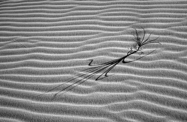
I found the textures and patterns of this image worked especially well in b&w printing. I have the impression that black and white images lend themselves more to printing, where color images may be more dramatic when projected.
| Camera: | Contax G2 |
| Lens: | Carl Zeiss Planar 45mm f/2 |
| Film: | Provia 100f |
| Exposure: | Not recorded but + 1 2/3 |
| Flash: | |
| Support: | |
| Filter: | None |
| Adjustment: | Normal workup in with attention to contrast. Conversion to b&w via mixer channels. I could not find any substantial diff' when adjusting the red, green or blue channels since the texture dominates this image. |
| Posted: | 06-Jan-2004 |
Rating: 0.00 (0 rating)
Comments
Linc
really beautiful shot. I like the way you use lines in this image and the sombre simplicity that you handle so well here. Perfect image for a b&w conversion, I would say. On my scale I would say 8,5 or maybe even 9. Let me think about it and give you time to open up for ratings :-).
Knut Skjærven 06-Jan-2004 at 11:00excellent
I love the shadows cast by the plant and the sand ripples.
Gregg Humphrey 06-Jan-2004 at 17:36Linc, welcome back
Love the lines through the image, love the shadows being more prominent than the primary subject, and love the detail in the sand.
Bob Michaels 06-Jan-2004 at 18:05Thanks guys!
Knut, When I was active earlier on the list, I had some of my best shots posted. The most popular that was getting 9's & 10's was eventually beat down to 8.00. Every other image I posted was less than 8. I am not in a hurry to have my hopes dashed on some of my best images and will just deal with the comments and critiques by not allowing rating. Bob & Gregg, thanks for the kind remarks. I know that b&w is your thing, but I can tell you that I am having a lot more fun grayscaling these images than messing with b&w in the darkroom or having them done by others. xp2 Acros, Delta 100, hp5 didn't give me anything that my conversions can't deliver. The main thing is that I am starting to "see" what makes a good b&w image. My focus is towards the scenes that I know will work well in b&w, even though I am using Provia 100f. You are only seeing the screen version of these images. The b&w prints from these images are as good as I have seen with b&w. Texture, detail, tonality- Everything is there and there is a lot more control with the end product. Highly saturated-sharp images in color are a joy to grayscale. If my slides are not what I want in color, I give a try to grayscale. Same slide-double duty. I now shoot my slides with an eye toward grayscaling. What more could you ask for? Linc
Linc 06-Jan-2004 at 20:20Just noticed this one -
this really is lovely.... and no dog....
mike wing 06-Jan-2004 at 22:36Excellent
What can I add?
Pete 06-Jan-2004 at 23:21:-)
i really like this. simple and very effective.
rachel miles 07-Jan-2004 at 00:18Hey,
Isn't this the same image that was previously posted as 'Minimalist'? I like the B&W version at least as much as I liked the original. I agree with what you said about conversion vs. using B&W-only films. Conversion allows you to apply filters afterwards, which is a great advantage. Plus, I don't think that 'real' B&W films are capable of containing more detail than converted color does.
BTW there's no horse in it, either :-)
Fabulous texture and line
Interesting comment on B&W prints versus projected colour slides, too. Whatever you are going with the greyscale is working extremely well.
Charez Golvala 07-Jan-2004 at 01:36Linc
this is one of your best ones ever. If you have a problem with "getting your hopes dashed" I would say that you mindset is initially wrong. What YOU like and what is objectively (or by consensus) excellent are two very different things. Don't mix the two :--). So just let ratings carry this one. If you want to be an "artist", others people´s opinions are a minor issue. The important thing is that you like what you are doing.
Knut Skjærven 07-Jan-2004 at 11:39Knut,
Your comments about ratings are interesting. The one thing you missed is that I said, ..."the image people favored the most" was beaten down to 8.00. This image was not close to my best, but others thought it was. Fine, but even the images that others find good don't make the grade. So I will continue to hide my vital parts. :-) Linc
Linc 07-Jan-2004 at 13:41This is wonderful...
and gets a "9" from me certainly. Don't despair regarding ratings...I get beaten down to 8 (and below) all the time. :-) This is a beautiful grayscale conversion, and I concur with your comments regarding the merits of such conversions to a point...but I certainly don't buy into the superiority of such conversions to the degree Wilfred does. A slide like this doesn't have significant shadow areas, so it can survive the conversion masterfully. But for slides with a broader range of tones and significant shadow areas, my experience is that the shadow areas can suffer significantly. Of course, since we're talking about 35mm and (presumably) landscapes, the penalty with slide conversions may not be worth crying about, given the small neg's limitations with detail, but with medium and large format, I'll stick with neg film for B&W landscapes, thanks.
Robert Mirani 07-Jan-2004 at 20:36Since
... I still cannot rate this, I would like to say that I would rate this '9', too.
Wilfred van der Vegte 07-Jan-2004 at 23:51