 ARCHIVE
Rope & Nets 2 - Carl Radford
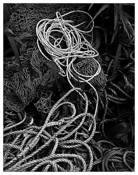
Rope and Nets without the mark down the right-hand side.
| Camera: | Contax G2 |
| Lens: | Carl Zeiss Planar 45mm f/2 |
| Film: | Ilford Delta 400 |
| Exposure: | |
| Flash: | |
| Support: | |
| Filter: | |
| Adjustment: | Scan of print. USM & levels - slight burn of bottom right corner. |
| Posted: | 16-Jun-2003 |
Rating: 8.38 (21 ratings)
Comments
Very Well Balanced
Very well balanced composition. A tough shot to maintain tonal range. Did you rearange any ropes or nets,or is it a found subject?
Don 16-Jun-2003 at 15:17This is how I found them Don...
I moved my feet to get the best composition :) That said I wouldn't've been adverse to rearranging them if I needed to but it's just nice to work with what you're presented with.
Carl Radford 17-Jun-2003 at 00:14I enjoyed the organized chaos in this picture and how it was all tied (pun) together with that one lighter shaded coil. This ozzes with texture.
Ed Ng 17-Jun-2003 at 00:52love it!
full of texture, and organised chaos! the leaves in the top corners frame it nicely and add a bit of contrast, and i think it would have lacked that 'something' had they not been there. the rope and seaweed tumbling through give it a sense of movement. quite simply i love it!
rachel miles 17-Jun-2003 at 01:17Ansel Adams style
Composition, grayscale balance: all perfect. If only we had more sharpness on the foreground ropes ...
Carlo Consoli 17-Jun-2003 at 02:58The print is
outstanding!
John Allen 17-Jun-2003 at 05:20Many thanks all...
for your comments - I appreciate you taking the time. The print is my best yet - shame it missed the print exchange!
Carl Radford 17-Jun-2003 at 05:27excellent use of tones
I'm sure this does make a great print. Please get it into the next print exchange.
Gregg Humphrey 17-Jun-2003 at 10:40-
Carl, very nice tonal and texture study. The positioning of the lighter colored ropes on the top was fortunate.
Bruce McKinney 17-Jun-2003 at 16:59-
Good seeing Carl! Nice image.
Kevin Conville 17-Jun-2003 at 22:26Impressive.
Has all the qualities I like in a photograph, texture, depth and contrast.
Benjamin Lynden 18-Jun-2003 at 09:48The more I look at some of the images of objects etc the more that I think this deserves my rating.
Dave Richards 22-Jun-2003 at 04:27As everyone said
- excellent tonality; excellent sharpness too. I also like the empty space formed by the deep-black areas. Not wanting to get detail out of the shadows can sometimes be a good idea, as this image shows. Anyway, wasn't it you who mentioned the empty space in my image of the old Japanese lady?
Wilfred van der Vegte 22-Jun-2003 at 06:18good one!!
wonderful exposure and good composition
Daniele Esposito 25-May-2004 at 03:01